“I’m not all that interested in painting,” Scott Lawrimore has been known to tell people—both painters and reporters. So what’s the current show, The Prom: A Semiformal Look at Semi-Formal Painting, doing in his gallery? For starters, it was curated not by Lawrimore himself, but by his gallery manager, Alex Ohge (a painter). And it’s February, a notably slow month in the gallery business. On the face of it, these two details might suggest that Lawrimore is simply filling space until the season gets going. But that would be far from the truth. The paintings hanging at Lawrimore Project are surprisingly good, bringing an unexpected bit of two-dimensional color—as well as a familiar sense of playfulness—to the gallery.
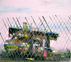
In the cavernous front gallery, the work that first pulls me in is L.A. artist Tomory Dodge’s shack behind a chain-link fence, a work in oil with an incongruously pretty, pink sky. Rendered in pastel tones, Survivalist shows, in more than one color, the marks of a paintbrush dragged across the canvas, taking the work a few steps away from perfectly realistic. Half falling down and seen through the repeated diamonds of a chain-link fence, the shack looks as if it might be situated within a junkyard. With the shack set against a cotton-candy sky, Dodge creates a strong juxtaposition of sweet hue and rough subject. This tiny work, 13.75 inches by 16 inches, is the one piece in the front gallery I responded to. The rest of the strong work, to my taste, is in the back spaces.
The central gallery is taken over by works of Nicholas Nyland, a Tacoma artist and a member of SOIL. Nyland’s watercolors are spare and graceful: threads of bright color pulled across mostly-empty paper, pigment stretched into loopy, wet sketchlike lines growing very pale in places. The skinny diagonals of watercolor in Nyland’s work create tension, and I wondered if these lines might have been created not by brushing color onto paper, but by applying a bit of paint, and hanging the paper up so one wet line of pigment drips, a single movement of color. Each of the three watercolor paintings on view—with three very literal titles, Web, Hammock, and Bridge—seems to operate this way, with strong angles, bright-but-thin lines of color, and generous use of negative space. Perhaps Nyland was inspired by the theory of dark matter; the world is mostly empty in these works. Tenuous, weblike structures stretch against empty pages that contain more air than colored matter.
On the floor is another work by Nyland: a canvas runner you can walk on. This piece, titled Passageway, 168 inches long by 30 inches wide, is all parallel lines of bright color that appear to have been marked out with tape, and that cover over what might be text behind the overlapping layers. Stepping onto the art, I skittered and laughed, self-conscious and feeling exactly not right with my feet on the paint. No matter that the artist promised me the work was sealed, that he had many more canvases at home, on his kitchen floor.
In the far back gallery space is a painting, by Brooklyn artist Tiffany Calvert, of a chandelier in a hallway—a piece that at first glance reads like a page from Architectural Digest magazine. Toying with background and perspective, Calvert creates a scene that might be a white banister in front of an expanse of blue wallpaper. Looking closer, the wall appears to be a Delft-blue landscape, or a Chinese silk painting of a mountain view rendered in the hues of a porcelain plate. The banister in front of the blue view is not quite accurate—it throws off any easy sense of perspective, interrupts the feeling of being in a real room. An ornate, brass, true-to-life chandelier hangs in the upper corner of the oil painting, further confusing the issue of perspective. With the theme of prom raised by the title of the exhibit, I can’t help but think of an awkward teenager not sure quite how to meet the parents, where to put his hands. Maybe his eyes are crossing, trying to make sense of what’s on the walls in this strange house. Or maybe that’s way too literal.
Robert Hardgrave presents several large, orgiastic paintings that seem to contain animal snouts, what may be elephant heads, and many slit eyes: a lot of pink and red and orange swim on his large canvases, among paisley and floral motifs. These richly busy works made people “ooh” and “ahh” at the opening but are too over the top for me.
If you like a painting more because it’s handmade, is that a bad thing? If you think a piece is a digital print, and then, reading the label, realize that it’s made painstakingly by hand, and you like it more for this very reason, is that legitimate? I’m not sure, but this was precisely my response to Yoon Lee’s monochrome swirl of dots, Subatomic Verve. It looks like an ink-jet print, a swirl of pixels on vellum, a sort of digital rendering of the Milky Way. And it is—sort of. Yee (who’s from San Francisco) manually translated a digital image of an engineering structure into a set of pixels on frosted Mylar. But instead of deriving from a laser printout, as this work at first suggests, each dot was pushed out of a squeeze bottle. Perhaps the knowledge that this work takes quite a lot longer to produce than just hitting “print” compels you, the viewer, to slow down in your looking. And maybe this sort of trickery, this sort of getting more than you bargained for, is exactly what Scott Lawrimore is getting at in this show. Technically, yes, this piece is a painting, but there’s an inside joke here, too: it’s exactly not quite what you expected.