SOME PEOPLE CAN’T SURF: THE GRAPHIC DESIGN OF ART CHANTRY
by Julie Lasky; introduction by Karrie Jacobs (Chronicle Books, $27.50)
“GRAPHIC DESIGN, if you do it right, is like throwing a pebble into a pond,” says designer and former Seattle resident Art Chantry on the phone from his new home in St. Louis. “And this pond is our culture. You can see the ripples happen, the little concentric circles coming out from where that pebble goes ‘plook!’ And one of the things I enjoy about what I do is I’m in a position where I can . . . watch the ripples happen.”
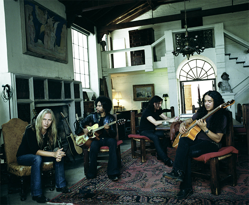
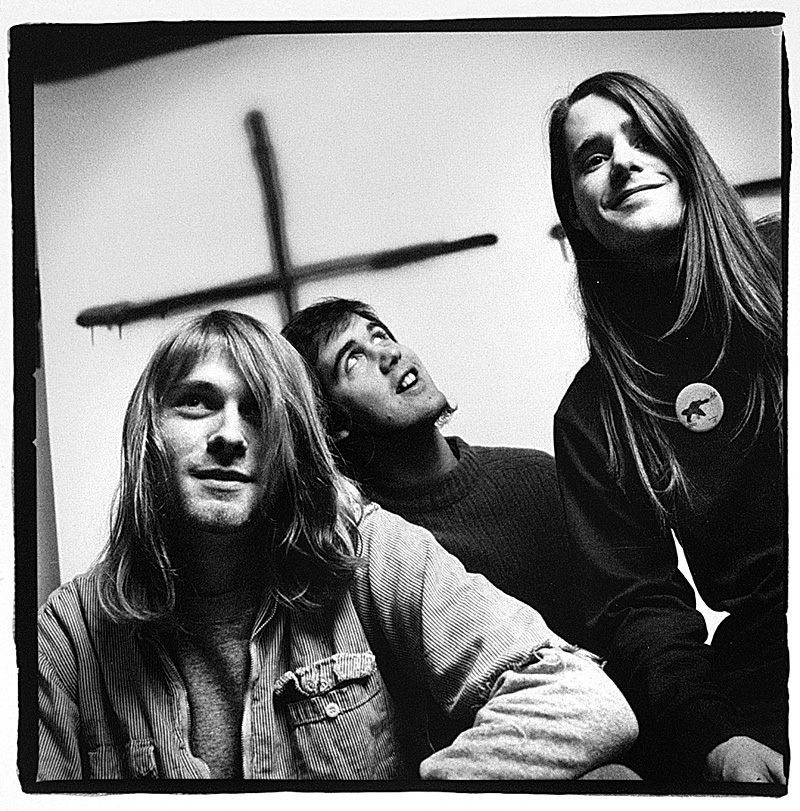
Chantry’s pebbles have made major waves in the pond that is Seattle culture; his albums covers, posters, logos, and flyers practically defined the city from the early ’80s on. The Tacoma native began his career designing posters for events at Fort Steilacoom Community College and Western Washington University, where he was a student, before relocating to Seattle in the late ’70s. Work for the UW led to work for the Bathhouse and Empty Space theaters, Sub Pop, and, when grunge took off, A&M and Warner Bros. He also served as art director of Seattle’s now-defunct music rag The Rocket for four different periods, the longest being from 1990 to 1993.
Indeed, Chronicle Books’ retrospective, Some People Can’t Surf: The Graphic Design of Art Chantry (written by Interiors editor Julie Lasky, with substantial input from Chantry) is a comprehensive scrapbook of the Northwest’s visual aesthetic pre- and post-grunge, from when the revival of labelmaker type was a joke exhumed for a 1990 COCA poster to its transformation into a visual signifier of “alternative” that is still used today.
Despite Chantry’s association with alternative culture, Some People Can’t Surf reminds you that the designer occasionally worked with more conventional clientele; his brochures for Safeco and Bahamasair are two pages away from his logo for Seattle’s first punk club, the Bird. But most of the book celebrates Chantry’s keen interest in grade-B Americana: surf culture, monster movies, and 1950s men’s magazines, with their campy “retrosexual” photo spreads of women.
A QUICK FLIP through the book reveals a primary theme in Chantry’s work: a love of recycling images. “I wanted to be an archeologist when I was a kid,” says the one-time garbage collector. “I wanted to discover lost civilizations and ancient cultures. I’ve always collected things. And now that I’m a graphic designer, all those interests come massively into play. I’m doing graphic design as a kind of pop-culture archeology.” The playfulness of Chantry’s worldview becomes apparent in something as small as his use of a romance comic panel for a coffeehouse ad, but the ultimate impact can be far greater. In 1991 he created an industrial-design style based on ’50s tool ads. First used in a series of posters for COCA events, it morphed into the “tool-looking” ads for Urban Outfitters and has now been subsumed into mass culture via Old Navy.
The key, Chantry explains, is reinterpreting old images in new ways. “Appropriation starts out as mere copycatting,” he says. “The difference is taking it beyond the copycatting stage. The more I experiment with imagery I’ve discovered, the farther it gets away from the source, the more ‘me’ it becomes. Then it becomes interesting. Like recreating the past in the present. And it’s not ‘retro.’ Because, even though you’re dealing with old vocabularies, your interpretation of it is modern.”
Chantry has no regrets about leaving Seattle for the Midwest. Though he admits to missing the weather, he also insists, “The Seattle I loved is utterly and completely gone; they’ve erased everything I cared about.” (One wonders: You might be able to take Chantry out of the Northwest, but can you take the Northwest out of Chantry?) What’s clear is that, wherever he’s based, Chantry’s interest in the egalitarian power of visual images remains paramount. “What’s nice about graphic design is it’s this language that everybody speaks,” he says. “Nobody knows they speak it, but they’re dramatically affected by it. Just picking the color red instead of yellow speaks volumes. You can change the way people think at a glance. It’s like the ultimate mind fuck.”