THE PERCEPTION OF APPEARANCE
Frye Art Museum, 704 Terry, 622-9250 10 a.m.-5 p.m. Tues.-Sat.; noon-5 p.m. Sun.; 10 a.m.-8 p.m. Thurs. ends Sept. 22
I confess to approaching The Perception of Appearance with trepidation. The Frye Art Museum, which organized the show, is a champion of Traditional Art and proudly out of step with most contemporary currents. Not a bad thing in theory, but in practice, the policy has led to a lot of terrible exhibitions, choked with fey, fussy work, smugly derivative, polemically “traditional.” In his catalog essay, guest curator Norman Lundin seems to be falling in line with the management’s ideological bias. Fortunately, the work he’s selected shows that Lundin’s idea of tradition is a far more generous and healthier one.
Frye curator Debra Byrne gave Lundin, an artist and UW professor, four criteria for inclusion: Each work was to be by an American, drawn not painted, and created within the last decade and to have the human figure as its subject. Lundin has tacitly set two further criteria: mastery of classical technique and a more ambiguous quality he calls simple “expression.”
What he means comes through clearly in the works he’s chosen. With few exceptions, they are quiet, inward, but not restful; poised might be the right word. There are a few pieces that confront you directly, like David Brody’s drawing of a young woman wearing only a transparent skirt and heels and staring at the viewer while peeing copiously. But plenty of other works go far enough beyond conventional figure drawing and portraiture to ensure that we don’t look too casually at the many classical “studio nudes” that surround them.
Judith Glantzman’s study of a contorted (crippled? deformed?) naked woman is halfway to expressionistic painting in the de Kooning vein; the balding, middle-aged man in Sidney Goodman’s charcoal is “realistic” enough, but the mound of sinuous female flesh he’s leaning forward to look at emphatically isn’t—at least at first sight—and the situation portrayed is, at the least, surreal.
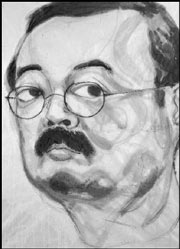
Lundin, over the objections of Byrne, has insisted on identifying each work only with a label bearing the artist’s last name. This can be a little annoying, but it has the immense advantage of forcing visitors to interpret what they see, not fall back on an artist’s interpretive rubric. Peggy MacNamara’s fragmentary rendering of a curled-up emaciated figure is more powerful if you don’t know she’s drawing a mummy; as for titles like The Very Young Medusa and Study for Encouraging the Coelacanth (Marci)—trust me, you’ll enjoy the work better not knowing.
We tend to think of drawing as a small-scale monochrome medium, but some of the most impressive pieces on view here are large and marvelously colored. Stephen Namara places a voluptuous reclining nude, all curves and soft shadings, against severe geometric background rendered in the same muted tones. Edgar Jerins’ charcoal “snapshot” of a shirtless gent with an enormous shotgun across his lap is all black but, at 5 feet by 8 feet in size, has as much variation in texture and tone as if it were Cibachrome. Lundin’s own contribution, an oil-on-paper nude, is modest in size but its dominant rusty-orange tone makes it uncharacteristically “hot” for this usually very reserved artist.
In his catalog essay, Lundin writes somewhat ambiguously about the importance of “expression” informing technique. He makes his point better without words. There are several works in the show featuring figures seen through water, and they’re all knockouts: The technical challenge of rendering a solid through an insubstantial surface seems to make apparently unemotional subject matter more intensely felt. Akio Takamori’s self-portrait in ink is simultaneously affectless and vehement through the way the ink wash has puckered and stained the paper bearing the image. Richard Piccolo’s pastel of a sidelong-glancing woman seems weighted with strong emotion; unless you’re an artist yourself (or read the small print in the back of the catalog) you won’t notice that the intensity arises from laying color down over jet-black paper.
I can’t explain why my favorite piece in the show moves me as it does. Catherine Murphy renders a woman’s side-lit, freckled upper back, chastely outlined by the shoulder straps and edge of a slip. Nothing could be more ordinary, but I can’t look at it without wanting to put my hand out to touch the skin of this woman whose face I will never see.
Exhibition designer David Anderson has done a knockout job of creating harmonies and rhymes and reflections among the pieces on view. Tim Doud’s charcoal of a blowsy, clothed Courtney Love look-alike seated in an armchair and Katherine Doyle’s of an utterly composed nude similarly seated are both fine on their own; side by side they’ll blow you away.