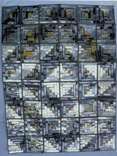
Text, typography, words, and alphabets–they’re not just the province of the writer. In this selection from the city’s Portable Works collection, 16 artists separately conduct a kind of Scrabble exercise in appropriating and rearranging terms of language. Here’s a familiar signboard aphorism from Jenny Holzer. There’s a flip-book architectural presentation from Elizabeth Connor. And Blair Wilson presents an entire comic-book series on one wall. But maybe the most engaging (if useless) work here is a wall-mounted quilt by Ross Palmer Beecher. It’s in the traditional American folk vernacular, woven together with crude, cheap materials: tin, wire, cut-up bits of bicycle tubes, and even tail lights from a car. But the main basis for Hershey’s Chocolate Quilt (1986) are the flattened tin cans. Do they even sell Hershey’s chocolate sauce in tin cans anymore? The world has gone plastic, so there’s retro appeal–like Warhol’s Brillo boxes–to the old packaging. And like other bits of commercial ephemera incorporated into Pop Art, Hershey’s has a great and instantly recognizable logo. It’s comfort sauce for comfort good, a token of home and childhood. The word, the letters, the shape and form–all have warm connotations, like chocolate sauce heated on the stove top for your ice cream or hot cocoa. But the quilt itself is entirely cold; who wants to be be wrapped in tin? BRIAN MILLER
Mondays-Fridays, 7 a.m.-7 p.m. Starts: Oct. 4. Continues through Dec. 30, 2011


