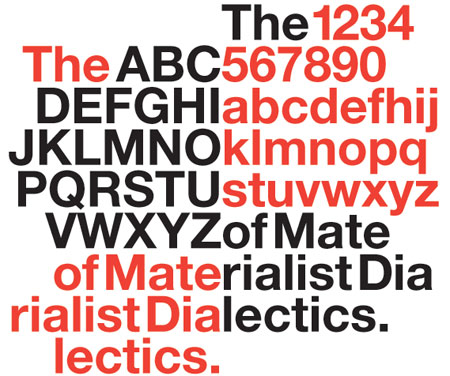
I left my screening of Helvetica with the unsettling awareness of just how much Helvetica surrounds me. The font is everywhere, from New York subway signs to American Apparel billboards. Director Gary Hustwit traces the path of the little typeface that could, from its development in a German type foundry (originally dubbed “Neue Haas Grotesk,” it was wisely rebranded) to its widespread adoption as the default font of modern life. The designers who embraced Helvetica in the ’60s were drawn to its textbook simplicity and supposed ability to act as a crystal-clear vessel for the words it spelled out. In the ’70s and ’80s, though, a generation of postmodernists flung Helvetica aside; with “Less is a bore!” as their rallying cry, they began to create loopy, hand-drawn fonts that they saw as more expressive and honest. Now the clean lines of Helvetica are trendy again. Hustwit wisely turns over most of the exposition here to a delightful and insane group of graphic artists, who tell the story of Helvetica in their own words. With the stylish simplicity of its namesake font, Helvetica keenly distills the eternal aesthetic battle between the classical and the baroque and explores what happens when a revolution goes mainstream. (NR) JULIA WALLACE Sat., Dec. 6, 5 p.m., 2008
Helvetica