CHEAP THRILLS
Henry Art Gallery, University of Washington, 543-2280, $6 Tues.-Wed., Fri.-Sat. 11 a.m.-5 p.m.; Thurs. 11 a.m.-8 p.m. ends Sun., March 10
RAYMOND LOEWY, George Nelson, Eliot Noyes, Charles and Ray Eames—these are the names that come to mind when thinking about influential American product designers. But Fred Meyer, Bartell, IKEA, 3M, Dunn Lumber, and Safeway? Who let them into the gallery?
Rhonda Lane Howard, that’s who. The curator took her cue from a traveling show that visited the Henry from New Jersey’s Newark Museum in 1929, presenting 70 well-designed consumer objects that cost 25 cents or less. Adjusting for inflation, Howard set a new figure of five bucks, then arranged for about 115 mostly local artists, designers, and architects to go shopping on her behalf. (Howard and other Henry curators also participated.)
To judge from the 100-plus articles on display, she probably got some change back. It’s a small, cheap, no-frills show, with objects grouped mostly on pedestals in a room painted light industrial blue. The cost and origin of each selection are displayed along with a brief rationale/rhapsody/defense/ haiku from the selector.
Despite such modesty, the exhibit seems larger and more impressive than the adjoining, much-hyped “Superflat.” (One enters the latter through the “Cheap Thrills” space as if elbowing past a busker outside the symphony hall.) “Cheap Thrills” doesn’t pretend to be art. Its most successful selections —and not all are—represent the mass-market convergence of utility and beauty. It’s the difference between Hello Kitty and the staple puller— a sleeper cell in the design world.
Take, for example, the humble hotel desk call bell. Form and function are perfectly conjoined. (One selector compares it, unsurprisingly, to a breast.) Chopsticks also work wonderfully well, and their hand-scaled design reveals one subcurrent to “Cheap Thrills”: As with kitchen tongs, elastic hair clips, pencils, quarters, and ballpoint pens, there’s a necessary tactile refinement and simplicity to the things we handle each day. They’re small (therefore cheap), and our fingers pass judgment over them constantly. (Consider how cell phones are so irresistibly touchable.)
Colored, translucent plastic emerges as the chief low-cost design trend. Check out the white shower curtain, orange rain poncho, green air mattress, clear-yellow lighter, and palm-sized translucent blue stapler. Of that last selection, artist Jeffrey Simmons notes, “Today it seems like the only thing that doesn’t look like an iMac is a new iMac.”
Metal is probably the second most popular material (wood being a distant third); a lone red terra-cotta flowerpot hints at ceramics’ loss of cachet. Faddism is clearly at work here. Remember the Memphis style of the ’80s? Stainless steel? Black? (There’s hardly a black- colored object on display.) Some cheap designs may be timeless and need no reinvention (see the aluminum ice-cream scoop); others must be regularly revamped for trendiness’ sake so that consumers might again fork over their cash for something that still doesn’t work very well.
CERTAIN items on display here only seem to justify the chooser’s need to soapbox, as, for example, the minty-breath tennis-ball dog toys (“At times, my dislike of dogs has made me feel somehow less than totally masculine . . . “). In a triumph of nostalgia over merit, the 57-year-old Slinky gets its own separate display stand. And that Styrofoam glider? Crap! They always broke on landing! There’s also a nod to children (with a kid-friendly podium lowered to their eyes), but the objects are kitsch— Silly Putty, PEZ candy dispenser (please!), and assorted sweets.
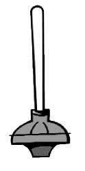
And where’s the danger? Absent is the murderous style of the bullet, the box cutter, the pack of smokes, the hypodermic syringe. Or is the baster with injection needle its safe kitchen analogue?
The latter reminds you how the posted list of 1929 objects skews entirely toward the home: Quimper bowl, Bon Bon dish, gravy boat, vases, glasses, plates, finger bowls. Their ancient retailers make one think of myriad dot-coms now also gone extinct. Gimbel, Hahne, Bibi, and J. Wanamaker—where are they now?
Replaced by OfficeMax, of course. The office is where the Aeron chairs, T1 lines, and flat-panel displays create a design gap over the home. It’s the terrain in front of us. (Quark we know; Quimper bowls we don’t.)
Case in point: The beloved Post-it note has been appropriated by dozens of gallerygoers for graffiti that’s often smarter than the selectors’ manifestos. (Can you blame them with pencils so close at hand?) “Marcel Duchamps lives!” proclaims one. “Ron— will you marry me?” asks another. Referring to the o.b. tampons clustered on the walls like flies (is this good design or good presentation?), one noter demands, “Tampons—a thrill for whom?” Sadly, many of these comments are fluttering to the floor and affixing themselves to shoes, so replenish them with your own critiques when visiting.
You’ll come away a little wiser and perhaps more attuned to affordable design in your own life. Here’s my partial list that you can add to after the show: Pink Pearl eraser, guitar pick, fishing lure, bicycle spoke wrench, cinder block, paper matchbook . . . just look around.