Some artists find their true vein early; others have to dig and dig before they strike gold. Andy Warhol was more than halfway through his short career before he discovered the genre that brought out the best in him. But in the early 1960s, the world was not much interested in what Warhol did best, so instead he did what interested the world. There is no reason to believe Warhol regretted his choice for a moment, but the exhibition of Warhol drawings and related graphics now on view at the Henry Gallery may leave a visitor feeling a little blue.
Andy Warhol Drawings, 1942-1987
Henry Art Gallery, ends October 8
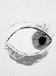
A penciled self-portrait of the artist at age 14 shows a Warhol already in command of the fundamentals of drawing, though it’s all bits and pieces. The rendering of the neck and the hair are strikingly assured, the gnarly, overworked ear and brusque crosshatched eyebrows less so; the upturned nose is strikingly modeled but verges on cartoon; the pouty lips are marvelous but look pasted on. Only the eyes—large, staring, lifeless—are wholly unconvincing. But eyes, as every aspiring portraitist knows, are the hardest part.
In the course of the 1950s, to judge by the material in this show, Warhol became a little obsessed with eyes, sketching page after page of them, but he never quite got the hang of bringing life into them. In the best pieces from this period, he avoids the issue by offering back views of his subjects: A few dozen rough strokes each bring to life a waist-to-shoes drawing of a pinky-ringed gent in very baggy pants, a seated girl-child in pigtails and a party dress.
Much more often, though, the eyes are stylized according to the conventions of poster and advertising art of the period: You can see more than a trace of the wiry line of Reginald Marsh or Ben Shahn’s sparse, inky energy in the work, even a hint from time to time of the Picasso of the late etchings. But more often you’re reminded of William Steig’s spidery cartooning or the commercial designs of Milton Glaser.
By the mid-’50s, Warhol was a reasonably successful commercial artist by New York standards, the only that mattered at the time. But all around him, other artists with roots just as “commercial”—Jasper Johns, Roy Lichtenstein, James Rosenquist—were suddenly achieving not just credibility but celebrity for work that coyly straddled the line between art and illustration, painting and “graphic design.”
Warhol’s non-ad work—mainly sketches of pretty model-boys in various stages of undress, as cute and kitschy as the drawings of kittens and monkeys from the same period—wasn’t calculated to attract the same kind of attention. You can see him casting about in the early 1960s for a gimmick of his own to set beside Johns’ branded flags and targets, Lichtenstein’s comic books, Rosenquist’s billboards: sketches of crude newspaper ads and headline layouts, movie-star head shots, ornate perfume bottles, paint-by-numbers kits.
Drawing branded objects like soup cans and perfume bottles seems to have liberated Warhol. Instead of providing graphic window dressing for such objects, by taking their “brandedness” for granted he could treat them purely as subject matter for his pencil, as purely as Chardin took his mugs, napkins, and oranges. Warhol’s pencil-and-watercolor MJB coffee cans are beautiful renderings of humble objects, utterly free of the self-conscious stylishness that mars all his pictures of living things.
Among the images essayed in Warhol’s breakthrough year of 1962, it was the soup cans that caught public and the critical interest. It wasn’t just the perversity of appropriating a commercial image as art that appealed and enraged; it was the fact that the appropriated image was “mechanically” reproduced, distancing the artist’s sensibility and hand still further from the finished product. Drawing was old hat. Silkscreen was in.
During the heyday of “The Factory”—during which period Warhol created his most notorious images, the Marilyns, Jackies, Maos, etc.—Warhol ceased to draw almost entirely. He found a solution to his difficulty with producing unsentimentalized renderings of the human face by ceasing to render it at all—by treating faces as objects as instantly identifiable but dehumanized as coffee cans or newspaper headlines.
Warhol’s return to drawing in the mid-1970s shows a hand undulled by a decade’s neglect. Although most of the drawings of this period are not freehand but scribbled in soft pencil over an enlarged image projected on paper, they throb with the same energy as the images from the early ’60s. Even the human face comes to life under Warhol’s pencil for a change, in two Polaroid-to-paper sketches of drag queens dating from 1975.
It was a brief reflorescence. The drawings of the 1980s, an ad for Absolut Vodka apart, are pretty sorry stuff, arbitrary in subject matter, coarse and indifferent in execution. The final “self-portraits,” produced a year before his death, show Warhol sinking to Peter Max level: The pencil is cunning as ever tracing the outlines of a solarized high-contrast image of the artist, but it’s nothing more than an arbitrary exercise in line. Limning his own features, Warhol is more indifferent than he was to that MJB can so many years before. The hand is still sketching away, but there’s nobody home behind it.
